Thursday, 18 December 2008

Foundation Portfolio - Main Task

The foundation portfolio main task involves producing a front page, contents and double page spread of a new music magazine. All the images and text used must be original, produced by me and have a minimum of four images.

As the beginning of this task I looked at how the media key concepts could be apply, I have done this by looking at the acronym LIIAR.

Language

The language which I will be using through out the magazine will be informal, fun and entertaining. The style of writing is going to match the genre of the magazine and set a theme running through out it, such as the title of the music magazine Kerrang which is a onomatopoeic and derives from the noise made when smashing an electric guitar. The colour of the font has to relate with the genre as the magazine will then look more effective.

Institution

There are a number of different music magazine publishers. Below is some publishers which I have researched to find out which music magazine publisher hasn't already produced a magazine with the same genre which I will be producing.

Bauer: The Bauer publishing group was founded in Hamburg 1875 by Johann Bauer. The publishing group has 238 magazines world wide in 15 countries as well as TV and radio stations. Bauer is the largest consumer magazine publishing company in the UK.

Bauer publishes three music magazines these are: Kerrang, Mojo and Q.

Kerrang! remains the market-leading music weekly with a devoted audience of rock fans driving sales of 60,289.

MOJO’s sales are up on the period to 106, 367 and is second only to stablemate Q in the sector. Combined Q and MOJO deliver almost half (43%) the share of the monthly music market. MOJO – which brings classic music to a new generation and new music to established fans – consistently delivers a bespoke fix of high quality journalism and iconic photography to music fans alongside.

Q retains its pre-eminent position as the number one music monthly brand in the UK and across Europe of 112,532.

Future plc: Future is an international special-interest media business, founded in 1985. Future produces about 100 magazines, over 70 websites and magazine exported to 90 different countries. Future sells more than 4 million magazines each month, they attract more than 18 million unique monthly visitors to our websites. They are also the number one for selling guitar magazines selling over 550,000 a month.

Future publishes twelve music magazines, these are: Classic Rock, Computer Music, Future Music, Guitarist, Guitarist Australia, Guitar Techniques, Guitar World, Guitar World Legends, Metal Hammer, Rhythm, Revolver and Total Guitar.

Ipc: IPC Media is a leading UK consumer magazine publisher. Almost two in every three UK women and over 45% of UK men read an IPC magazine. That's almost 27 million UK adults and produces 80 magazines.

Ipc produces three music magazines, these are: Guitar and Bass, NME and Uncut.

Guitar and Bass: Essential reading for the serious guitarist, with dozens of guitar tests, playing techniques, an exclusive bass section and in-depth features on guitar heroes past, present and future.

NME: The NME is the longest published and most respected music weekly in the world. Every week it gives its readers the most exciting, most authoritative coverage of the very best in contemporary music. The award-winning www.nme.com, launched in 1996, has grown to be the biggest commercial music news site in Europe.

Uncut: Uncut is the UK’s most authoritative music and movie magazine. Uncut celebrates all that is great in rock and film, both new and old, cult and classic.

Ideology

The aim for the music magazine will be to inform and entertain the targeted audience which I will chose. In my magazine I will be including the latest news on both new and recent and old bands/artists, upcoming shows and interviews.

Audience

The main target audience for the magazine is going to be aged between 18-24 years, both male and female.


Representation

As the main target audience is aimed between 18-24 years and both male and female, the magazine needs to represent this age group by making the language fun and entertaining but at the same time serious.


Friday, 5 December 2008

Foundation Portfolio Evaluation

Foundation Portfolio evaluation

· In what ways does your Media product use,
develop or challenge forms and conventions of
real media products?

The different forms and conventions used in my magazine front page and contents page are similar to those used in real media products. On the front cover I used the following conventions which appear on many magazine front covers; title of the magazine, date and issue of magazine, bar code, main photograph (of a student) and text to support the stories which will appear inside.

On the contents page I used: title, stories and what page they will appear on, photographs supporting inside stories and.....

· How does your Media product represent
particular social groups?

My Media product represents anyone who is interested in photography and would enjoy learning more about the subject and the technologies.

· What kind of Media institution might distribute
your media product and why?

The type of media institution which might distribute my media product would be some one who has distributed college magazines before, such as the media institution of the secondary teachers and primary teachers. My magazine is similar to these two products as it is free for every one who is interested.

· Who would be the audience for your Media
product?

The main audience for my media product is for people who are thinking on choosing one of the courses, and people who have just started the course that would like to more information about how certain things work, such as photoshop.

People who are also already on the course are likely to get a copy because there is information which could be useful to them, such as what you could the with your A level result after college.

· How did you attract/address your audience?

I attracted/addressed my audience by chosing bright, bold colours for the text and having a photographic background.

· What have you learnt about technologies from
the process of constructing this product?

From the process of constructing this product I learnt how to use a professional camera and how different lighting, angles and the setting can affect the appearance of the final image. I also learnt a lot of skills on photoshop, these where things like how to use the crone tool. I now feel confident in using this piece of software again.

· Looking back at the preliminary task, what do
you feel you have learnt in the progression
from it to the full product?

Looking back at the peliminary task I feel that I have learnt a lot from the progression from it to the full product.

Final front page and contents page


Wednesday, 3 December 2008

Analysis of front cover

I will be using photoshop to create my front page magazine. I am going to explain below each step I take whilst creating the front page cover, this will also include a number of images to support my explanations.


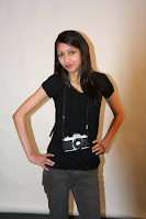
I chose to take a photograph of this person because she is currently studying A level photography. Before I took the photograph I set up the studio and pulled down a white roll of paper to create the white background. I chose to have a white background instead of any other colour because she is wearing a black top and grey jeans this creates good contrasts. I used studio lighting which kept shadows on her face to a minimum.


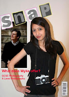
The picture to the right is what I created first for my front cover of a college magazine. The reason why I decided not to use it, is because there is to much going on and it is all cramped in, even though I hadn't finished it. This can look confusing to the consumer, and may be difficult to understand the message which it is trying to put across.


I decided to use this photograph as my background of the front page because.....
Before I put anything onto it I decided to crop it down, this was so there wasn't to much going on in the photograph which distracted the audience from the main view of
the magazine.

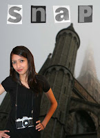
The image to the right shows how much of the background image cropped, it also shows that I blurred out the background image slightly so that it wasn't the main focus of the front page. I did this by selecting filter then went onto blur which then gave me a selection of different types of blur which can be created, I chose the Gaussian blur and changed the radius to 2.0 pixels. I thought that this would be a good amount to blur the background image because it was the right amount to not distract the targeted audience from the rest of the cover.

The next thing I did was cut out the photograph of the student I chose by selecting the polygonal tool which I carefully selected the outside of the student copied then pasted it onto the background image. I then put it in a few different places to find the place which looked the most effective.

With the name of my magazine I decided to cut out letters from the newspaper as it is a more creative way of doing the name, which works well with the photography magazine. After I had cut these out I took photographs of them put them into photoshop and cut them out using the polygonal tool, copied them and pasted them on to the background.

The image to the left shows the next steps I took to completing my front cover page.
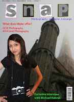
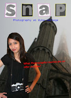
First of all I decided to go around each letter of the name of my magazine in two different colours, these are pink/purple for the letters on the white background and yellow for the letters on the black/grey background. I did this so that the name stood out slightly more from the background then what it did before. I did this by selecting the brush tool then changed the colour by selecting the colour picker. I also changed the opacity slightly so the colours weren't to bright and stood out to much.
The next thing I did was use the horizontal type tool under the name of the magazine to give the audience an idea of what the magazine is about, I used a dark blue colour because it works well with the background colour. I also wrote a bit about one of the stories on the cover to show what was in the magazine. I did this in red so it stands out from the background of the front page.

To the right is my final product.