I will be using photoshop to create my front page magazine. I am going to explain below each step I take whilst creating the front page cover, this will also include a number of images to support my explanations.

I chose to take a photograph of this person because she is currently studying A level photography. Before I took the photograph I set up the studio and pulled down a white roll of paper to create the white background. I chose to have a white background instead of any other colour because she is wearing a black top and grey jeans this creates good contrasts. I used studio lighting which kept shadows on her face to a minimum.
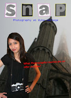
The picture to the right is what I created first for my front cover of a college magazine. The reason why I decided not to use it, is because there is to much going on and it is all cramped in, even though I hadn't finished it. This can look confusing to the consumer, and may be difficult to understand the message which it is trying to put across.

The picture to the right is what I created first for my front cover of a college magazine. The reason why I decided not to use it, is because there is to much going on and it is all cramped in, even though I hadn't finished it. This can look confusing to the consumer, and may be difficult to understand the message which it is trying to put across.

I decided to use this photograph as my background of the front page because.....
Before I put anything onto it I decided to crop it down, this was so there wasn't to much going on in the photograph which distracted the audience from the main view of
the magazine.
Before I put anything onto it I decided to crop it down, this was so there wasn't to much going on in the photograph which distracted the audience from the main view of
the magazine.
 The image to the right shows how much of the background image cropped, it also shows that I blurred out the background image slightly so that it wasn't the main focus of the front page. I did this by selecting filter then went onto blur which then gave me a selection of different types of blur which can be created, I chose the Gaussian blur and changed the radius to 2.0 pixels. I thought that this would be a good amount to blur the background image because it was the right amount to not distract the targeted audience from the rest of the cover.
The next thing I did was cut out the photograph of the student I chose by selecting the polygonal tool which I carefully selected the outside of the student copied then pasted it onto the background image. I then put it in a few different places to find the place which looked the most effective.
With the name of my magazine I decided to cut out letters from the newspaper as it is a more creative way of doing the name, which works well with the photography magazine. After I had cut these out I took photographs of them put them into photoshop and cut them out using the polygonal tool, copied them and pasted them on to the background.
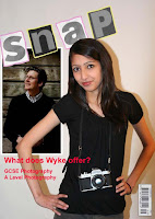
 The image to the left shows the next steps I took to completing my front cover page.
First of all I decided to go around each letter of the name of my magazine in two different colours, these are pink/purple for the letters on the white background and yellow for the letters on the black/grey background. I did this so that the name stood out slightly more from the background then what it did before. I did this by selecting the brush tool then changed the colour by selecting the colour picker. I also changed the opacity slightly so the colours weren't to bright and stood out to much.
The next thing I did was use the horizontal type tool under the name of the magazine to give the audience an idea of what the magazine is about, I used a dark blue colour because it works well with the background colour. I also wrote a bit about one of the stories on the cover to show what was in the magazine. I did this in red so it stands out from the background of the front page.

To the right is my final product.
No comments:
Post a Comment